LA Fitness
Mobile app redesign.
Project Brief
Challenge
LA Fitness is one of the world's leading fitness chains, with hundreds
of
locations across North America.
Having personally attended the gym for over 2 years, I was not aware of an official app.
However, I discovered the app to be unattractive and difficult to navigate.
I sought to uncover if others held a similar opinion, and so challenged myself to redesign the LA
Fitness app.
Identified Problem
Current app suffers from poor UX, UI and overall dated design across. I found most users have difficulty accessing basic functionalities and features. Little user customization and optimization.
Value Proposition
The current design is a lost opportunity to better engage its vast audience. An improved design would enhance user experience and promote customer loyalty.
Goals
Redesign the current LA Fitness Gym mobile app to provide improved UX and UI, for ease of functionality, thus providing greater value to the customers.
App Analysis
Core Functionality
It was essential to first conduct an in-depth analysis of the application, as it exists currently.
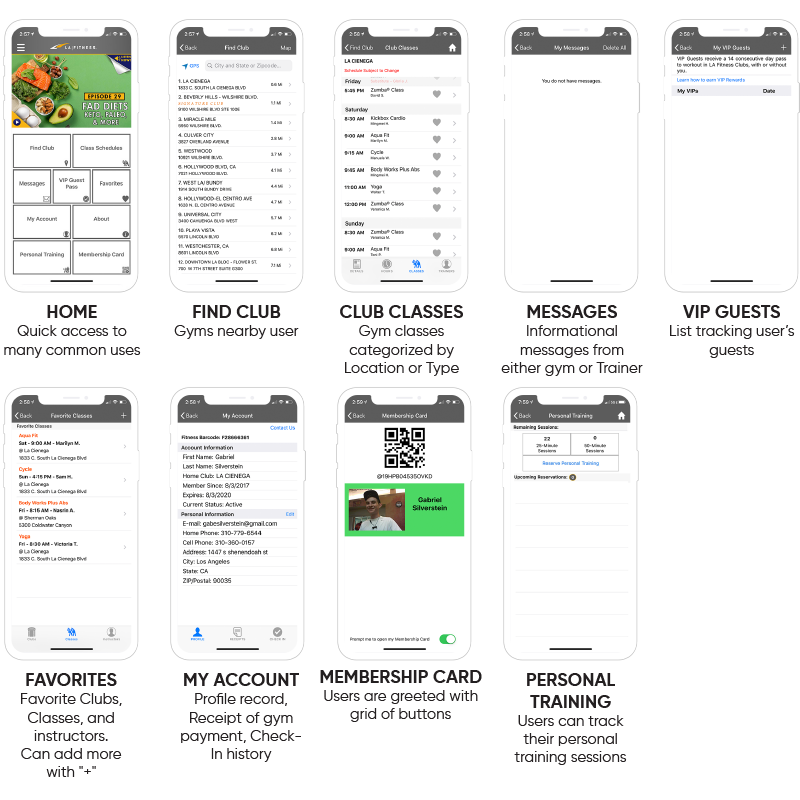
Here, I’ve summarized the basic
functionalities
accessible from the main sections from the home
screen.
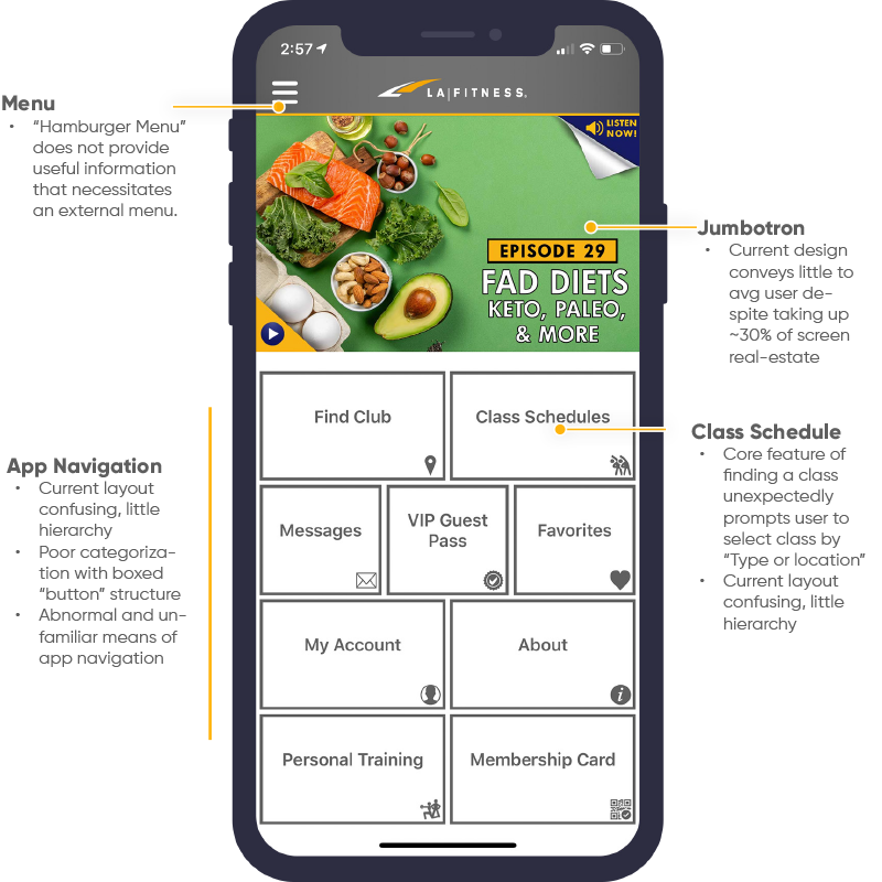
Home Page
I needed to understand its general structure, core functionalities, and overall architecture.
Research
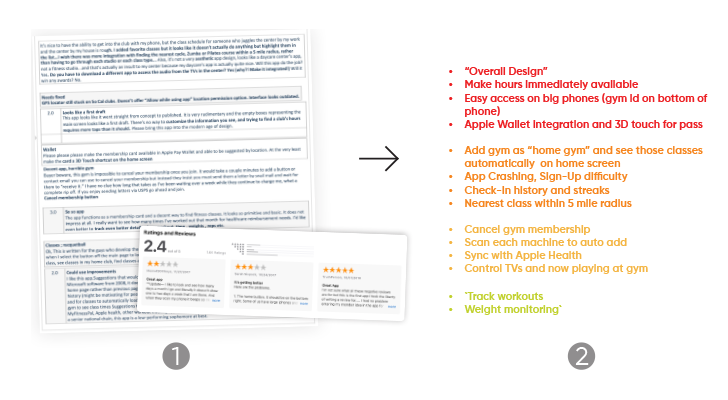
Customer Feedback
I wanted to gather feedback on the application’s current design.
What features do users find helpful or confusing, or simply desire?
1. Thus, I researched and recorded customer feedback across multiple channels: 1) iOS App Store 2) AppAnnie.com 3) Google Play 4) Online forums.
2. Next, I categorized findings based on importance + frequency
of pain-points.
Organized feedback into several categories for implementation:
Must, Should, Could and Won’t have.
Competitive Analysis
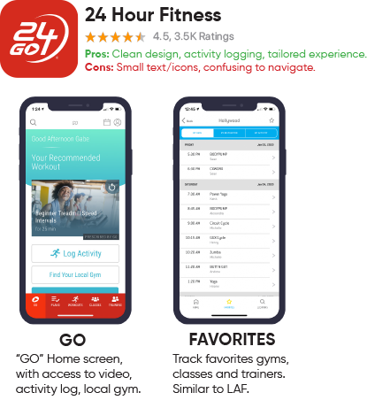
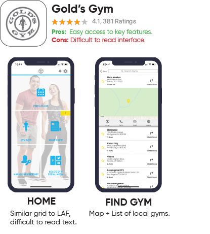
To better assess other, similar "successful" apps in the market, I conducted a competitive analysis. Closest competitors: 24 Hour Fitness and Gold’s Gym. Observed numerous other fitness-tracking and membership apps to gauge design trends, alternative features.
Who are LA Fitness’s competitors?
Interviews + Use-Case Scenarios
I wanted to uncover the application’s current feedback.
What do people really think of the LA Fitness app, as it exists currently?
 David
DavidUses app to: check hours and general info, rarely to check-in.
Pain-point:
Can’t easily locate favorite gym or
navigate app.
"The app looks old fashioned. It's hard to navigate, and buttons are not where they should be." There should be a "Home Gym" feature so I can easily see hours and classes.""
 Joe
JoeUses app to: check-in and schedule/track personal training sessions.
Pain-point:Hard to find training sessions.
"It is difficult to track reservations. I wish things were organized better, and more pleasurable to use!”
 Madison
Uses app to: get into gym via virtual Membership card.
Pain-point:Slow access to Membership Card.
"I need to quickly access my membership card. I think its annoying... that you have to press 3, 4 or 5 buttons to access anything.""
Interview Takeaways:
2. Re-categorize frequently accessed features based on importance, to be accessed with less buttons.
3. Enhanced user customization, personalization.
User Testing (Current App)
How do users complete core actions? Discovered via user testing to find pain-points in current app design. Asked users to speak-aloud their thought processes, to better grasp their intentions, interactions, and emotions.
(Common app uses based on interviews + research)
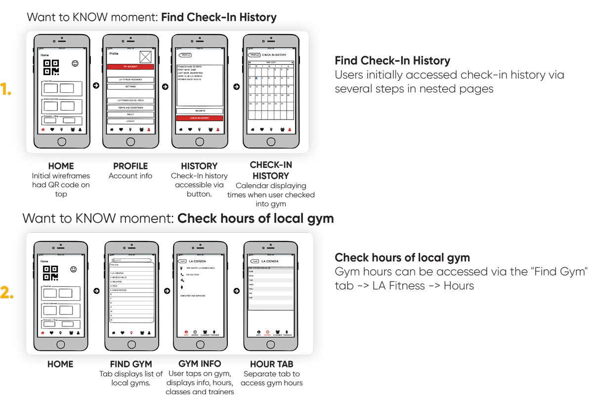
1. Check hours of local gym
2. Find Check-In History
3. Find a class and RSVP
How do real-world users interact with the current design?
What are [the apps current] core
flaws?
What do users expect?
David
1. Not intuitive, but was able to locate in ~20 seconds.
2. Ibid, but did not understand calendar view.
3. Quickly found, unable to RSVP.
What worked/didn't?
Finding Gym hours was generally easy to find but check-in history was difficult to
locate.
Joe
1. Did not know where to go, could not find hours.
2. Pressed several buttons and menus, but could not find.
3. Uses functionality already, quickly found.
What worked/didn't?
Booking class working fine.
Knows only desired functionality from previous experience.
Madison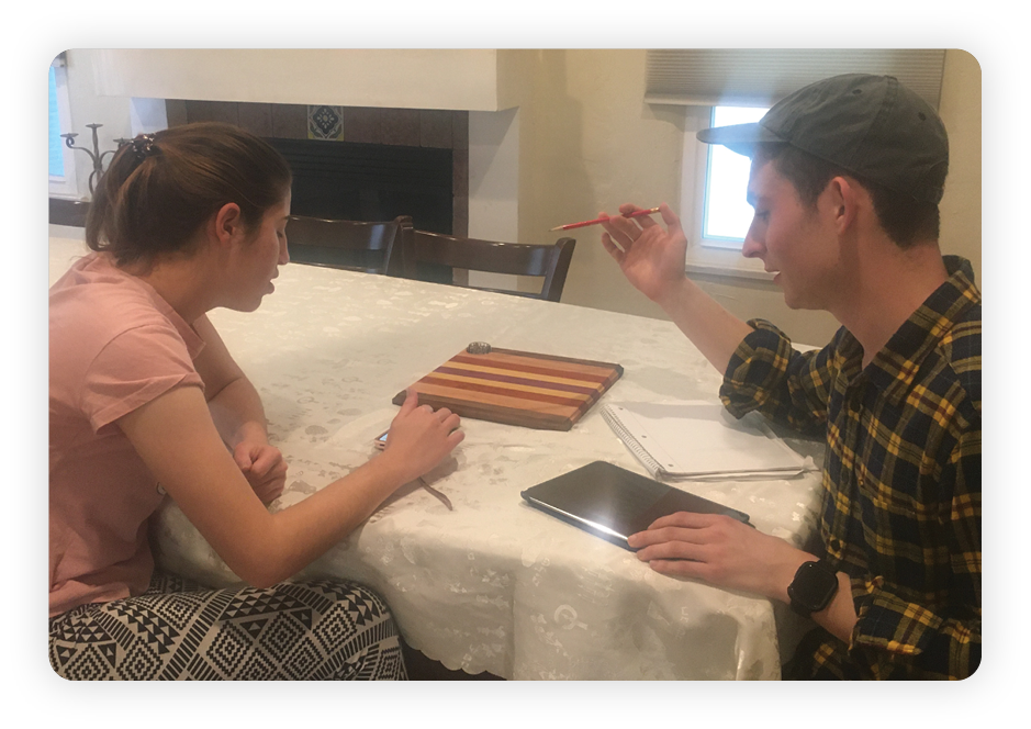
1. Pretty straightforward, but had to press so many buttons.
2. Thought would be under class schedules, but eventually found via random pressing.
3. Significant trouble finding, had to tap 5 btns on home to find.
What worked/didn't?
Got used to current app but generally found functionality slow and frustrating!
Storyboards
Created an illustrated series of storyboards based on interviews to help visualize my user's pain-points, and how they might interact in a real-world environment. Used as reference point when sketching my ideas for my redesign.
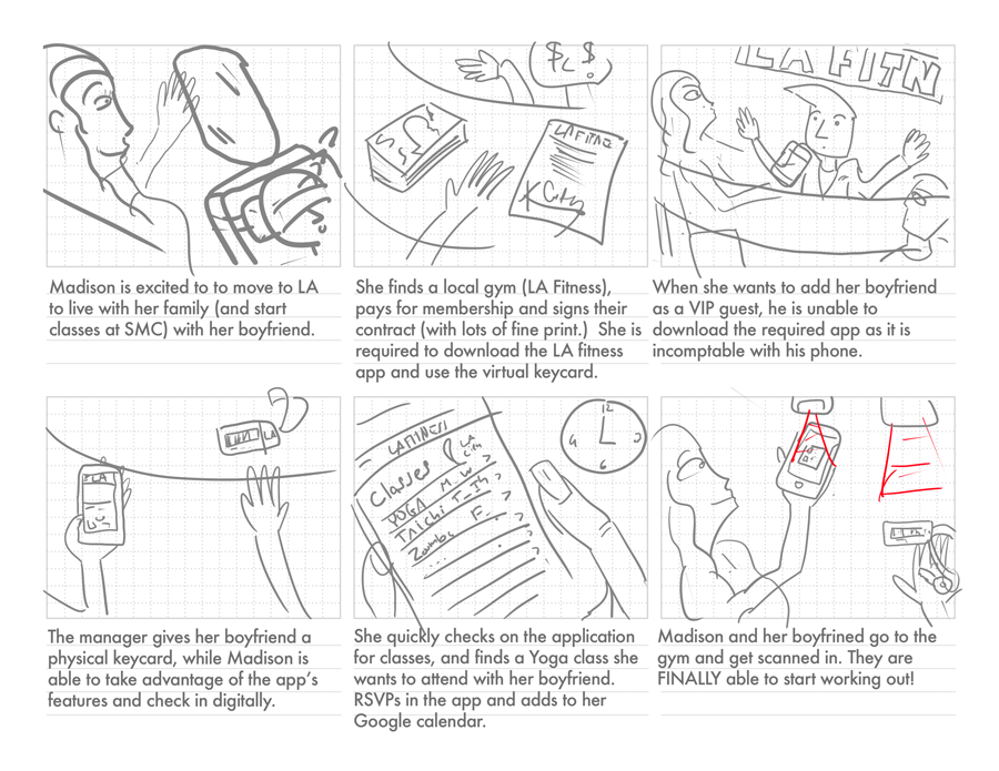
Here, Madison is flustered as she tries to use the app to check-in using the mobile app.
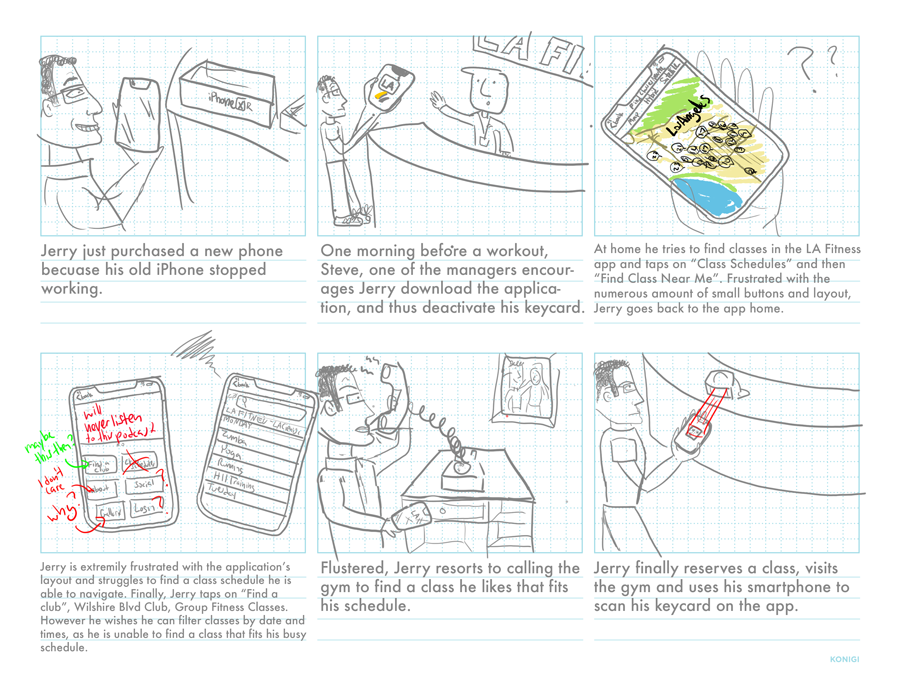
Here, Jerry is frustrated by the "Map View"
of local gyms nearby,
frustrated, he calls the gym for
information.
Initial Sketches
Created an illustrated series of storyboards based on interviews to help visualize my user's pain-points, and how they might interact in a real-world environment. Used as reference point when sketching my ideas for my redesign.
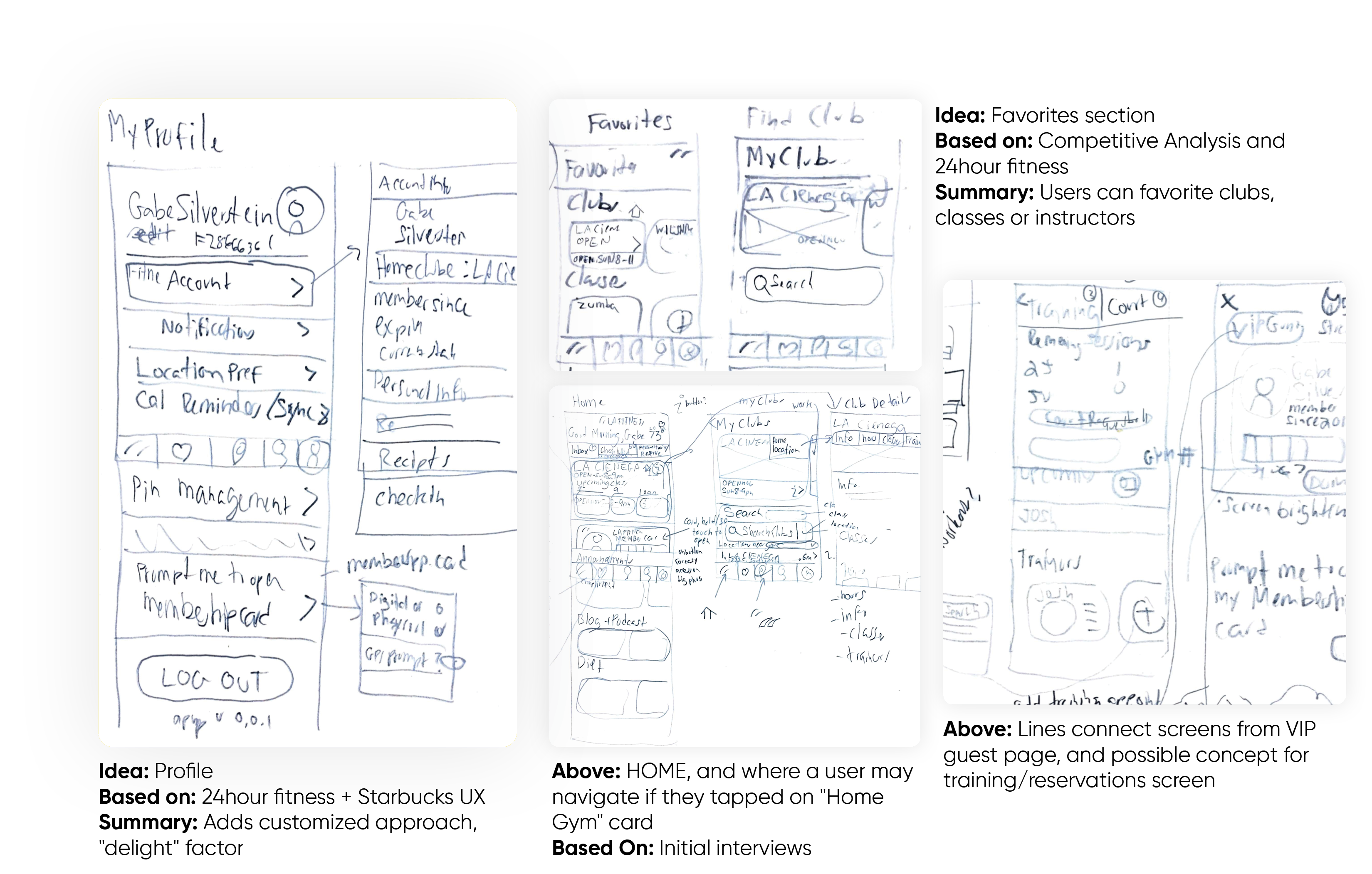
Wireframes/Lo-Fi Prototypes
Created wireframes (and converted into rough prototype via InVision) to
quickly grasp how users interact with nested page structure.
Used to gather feedback and test, to
better lay out and design my Hi-Fi prototype.
Designed userflows for main 3 core tasks.
Lo-Fi Prototype: User Testing and Findings
Tested Lo-Fi using same 3 core tasks. Tested effectiveness and
usability.
Reflected on research findings, I discovered what may be a design flaw.
I thought simply integrating a Tab navigation bar would fix the design, but users still found it
confusing.
Insights:
What new information did I learn?
This testing proved extremely useful in my design process.
I learned several key insights that I will 'fix' and design for/improve for in my next hi-fi
prototype.
Key insights included:
- In all 3 user tests, users clicked on the "Classes Tab".
- "Find Gym" button tab is confusing and difficult to navigate.
- All users did not initially go to account to find "Check-In History" but rather did so as an alternative option.
Design Revisions:
What must I revise?
- Make Check-in history a button on the home screen
- Add a "Home Gym" feature.
- Add a button for users to reserve a personal Trainer session.
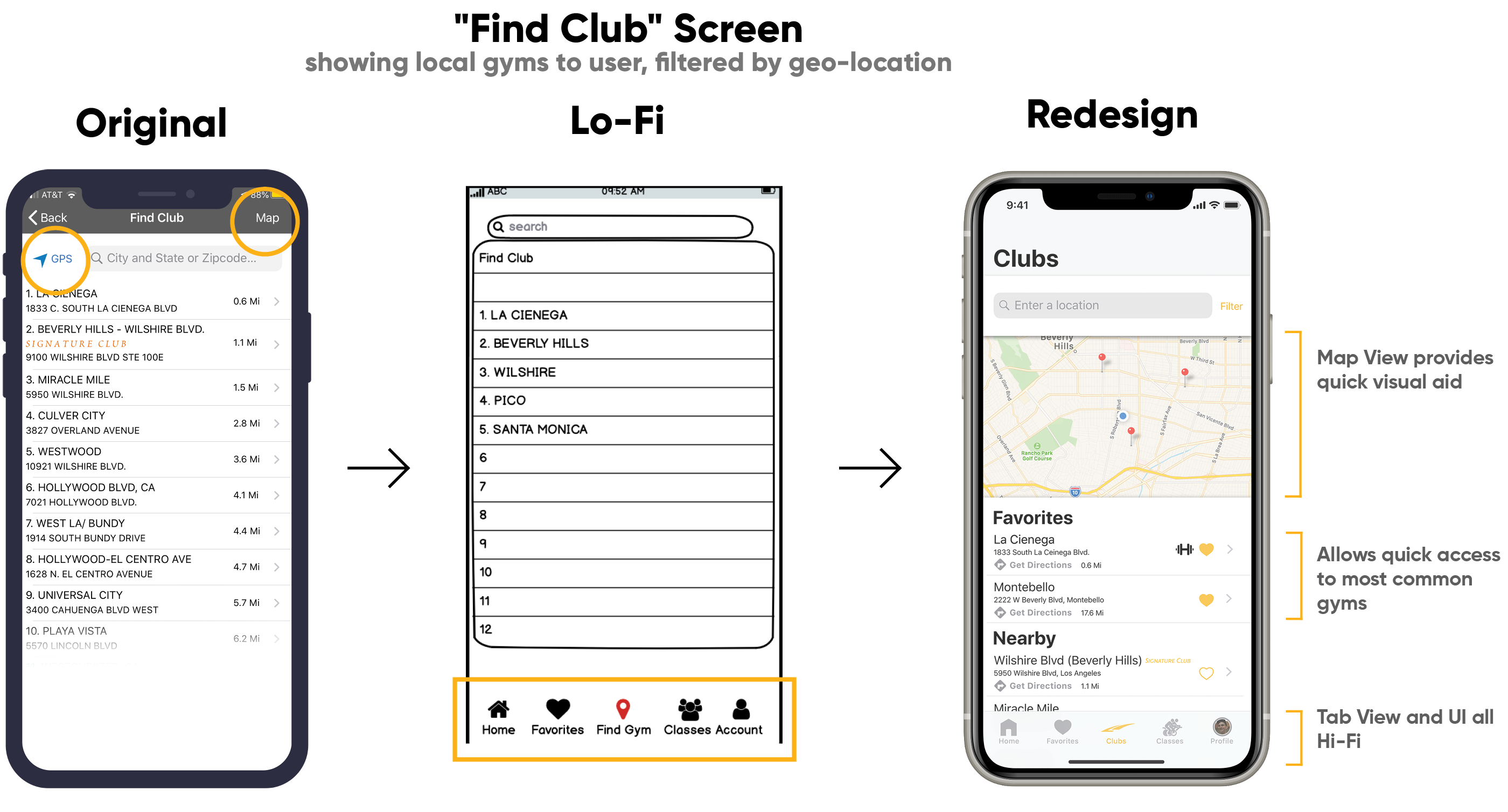
- Change layout of the "Find Gym" tab. Users would likely NOT search for a new gym all the time!! -> Most people only go to one gym!
Self Evaluation:
What went right/wrong?
When initially creating the wireframes, I thought that simply having these screens separated into tabs would improve the UX.
I found users to be very confused regarding user flows as well as an accessible "Classes" tab, a core functionality.
Redesign: Hi-Fi Prototype + Design Evolution
Now it was time to implement the Design Revisions + insights from what I learned in my multiple user tests. Employed research findings (customer complaints + feedback) and factored into Hi-Fi design..
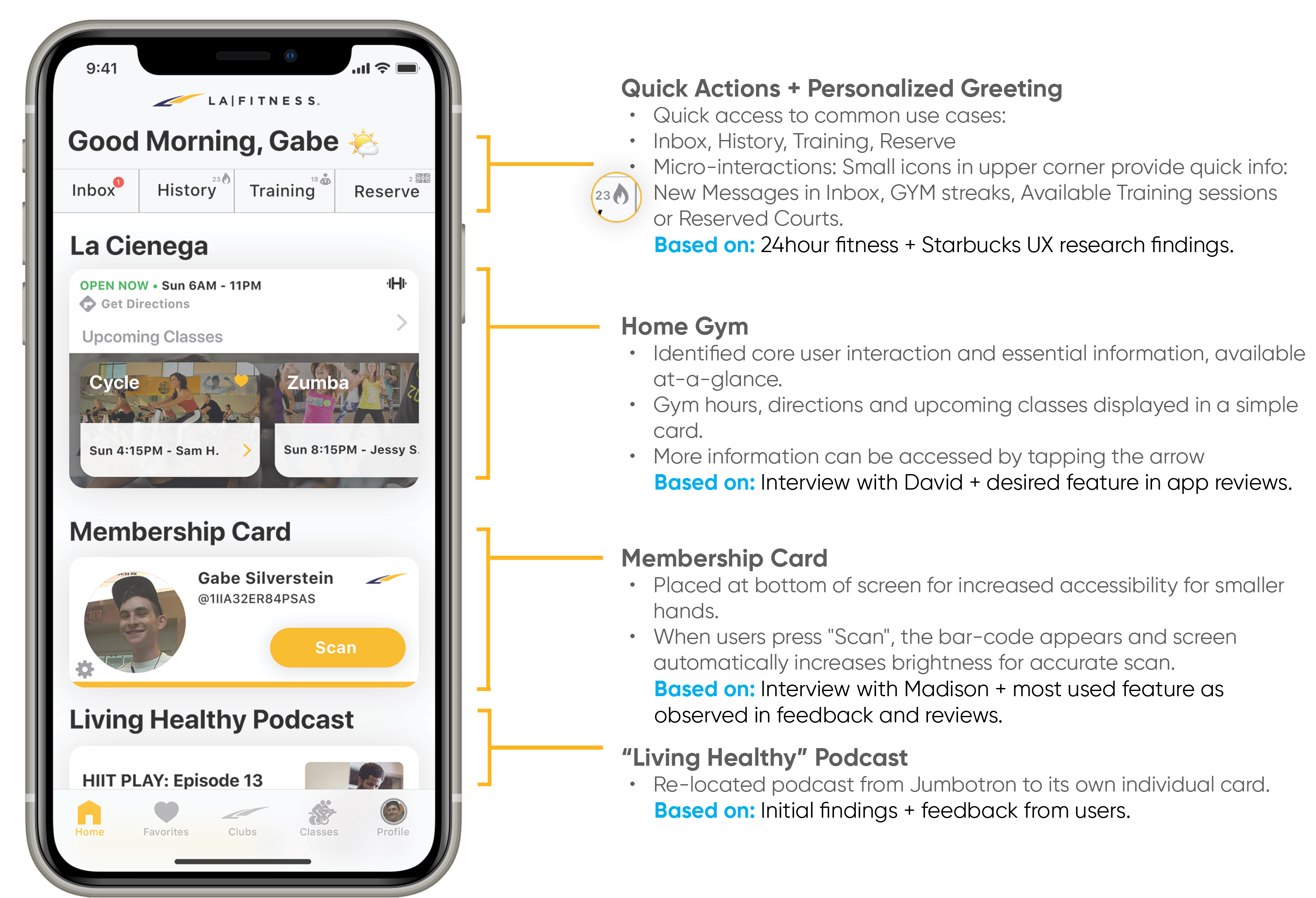
Redesign: Home Screen
Redesign:Navigation
Summary
Replaced old “brick” button navigation with more traditional NavBar, with easy access to several core functionalities.Categorized into five main tabs: Home, Favorites, Clubs, Classes and Profile
Reasoning
Users had difficulty finding what they needed in original app. Thus, I gave each function its own designated page. Even though this may result in some overlap in functionality, this modification will provide than one route to complete a task.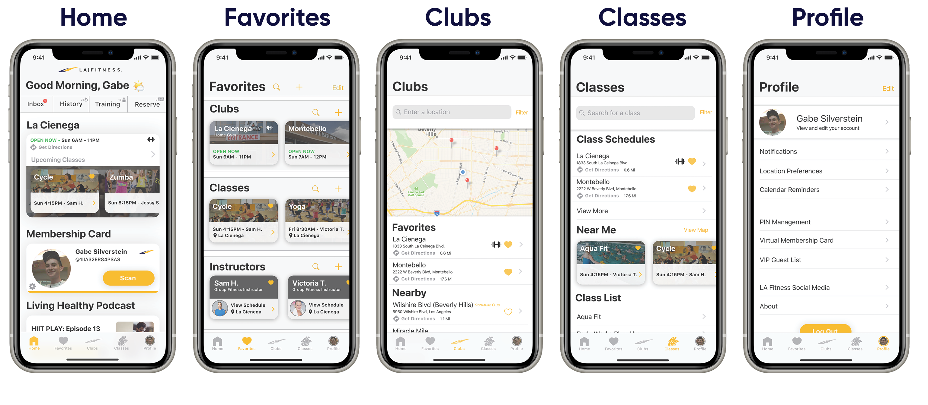
Redesign: Feedback
DavidQuite an upgrade from the original app, in terms of the sleekness, has modern updated feel... it makes it feel like it is my app, for my gym.
+ Visual design.
+ User personalization.
• Would ideally like to see a list of gym check-in history and to be able to change the days needed to maintain streak.
JoeThat is a huge improvement from what they currently have. Are you going to pitch it to them?
+ Navigation Bar easy to use.
+ Likes "Find Gym" page layout.
+ Overall visual improvement and more logical placement of items.
• Later suggestion to view profile on home screen, changing its location.
• Calendar page and visual way to log, track and see workout + health history, from multiple
apps.
MadisonEverything looks well designed, and common features are accessible without pressing so many buttons!
+ Found very easy to use.
+ Liked how everything was so easily accessible. Better experience!
Reflection
Redesigning LA Fitness has been one of the most inspiring and enjoyable projects
I've tackled recently.
I worked closely with the test subjects throughout this process to better understand how they might
think, to provide a better user experience. This allowed me to to better understand the diverse
range of pain-points and perspectives of potential users. Plus, I learned flaws and insights of my
design I would have not have noticed otherwise.
The ideas/feedback I received from multiple perspectives was highly valuable in my design process.
Disclaimer: This project is no way affiliated with LA Fitness.
The
discoveries, design ideas, and
recommendations I describe here are strictly my own.
LA Fitness and LA Fitness logo are a
registered copyright of
LA Fitness Inc.
Projects you might like