Gold's Gym
Brand Identity Design
My Role
Product and Graphic Designer
Timeline
Spring 2020
Project Brief
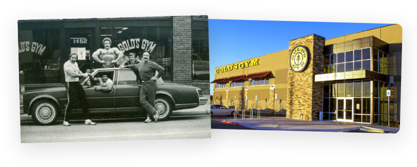
The original logo was created in 1965 by Ric Drasin and Joe Gold in Gold’s
Gym beginnings in Venice Beach, quickly turning the mascot into a cultural icon.
With over 700 locations, serving over 7 million people across the world, the gym was ripe for an update
to modernize, recharge and unify the brand.
This new direction represents a reach into a broader demographic seeking a more inclusive and diverse
gym experience, while maintaining its “Golden” reputation.
Goals
Redesign the Gold's Gym brand for a refreshed brand identity for a more diverse audience, while retaining the brand's rich history.
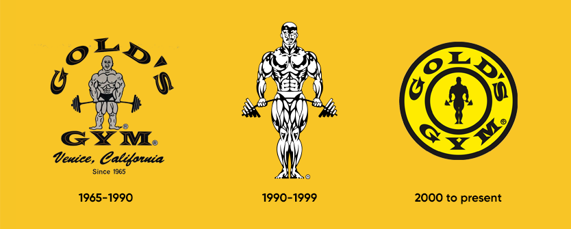
Logo History
As luck would have it, the logo itself sparked Golds spread across
California.
In 1973, Bodybuilder Ric Drasin created a new logo for Gold’s Gym on the back of a napkin. T-Shirts
sold out in minutes, putting Gold’s on the map, and making the mascot world-famous.
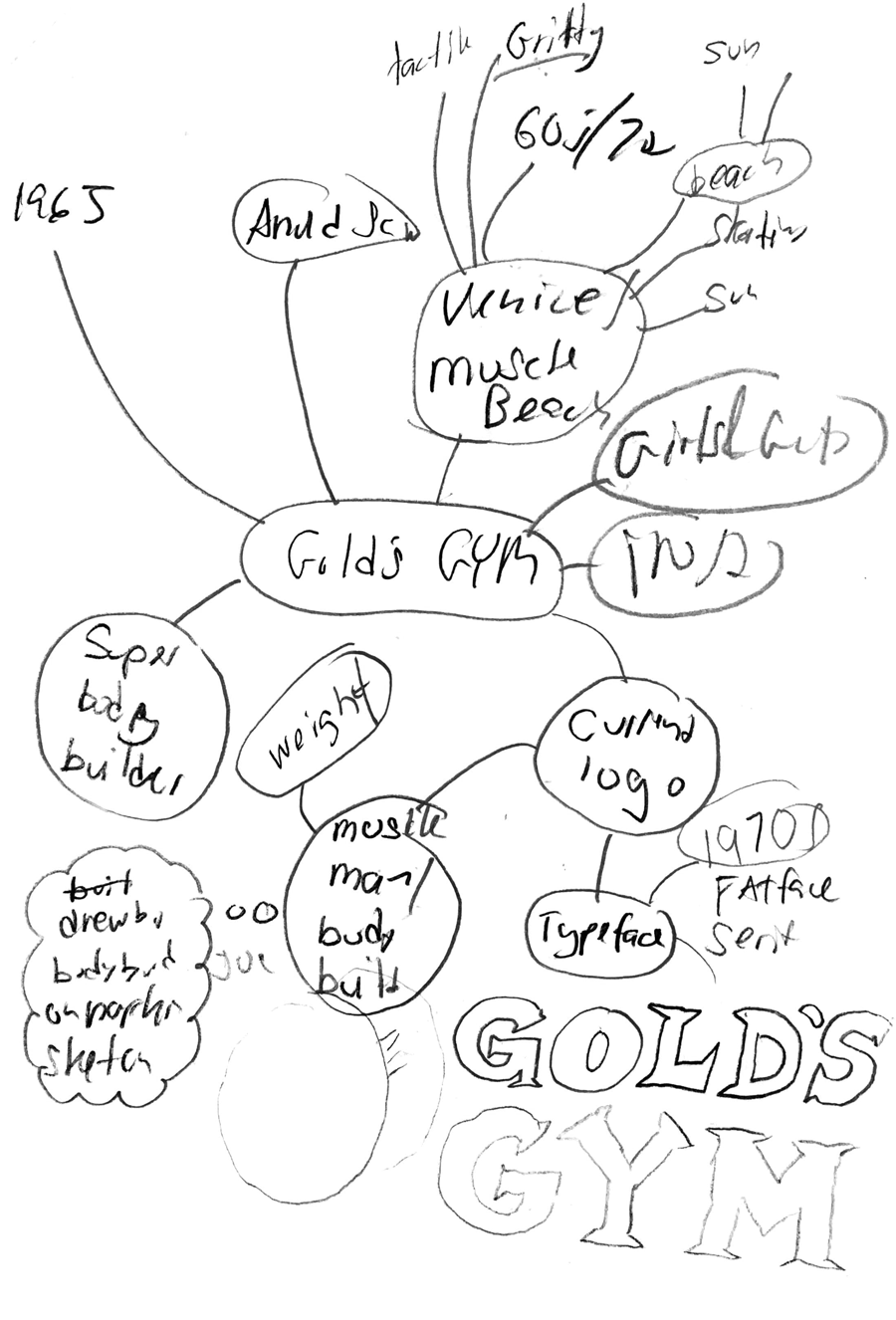
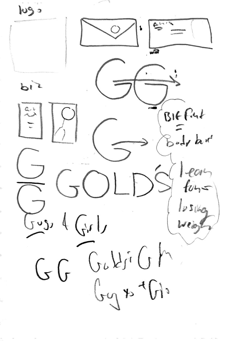
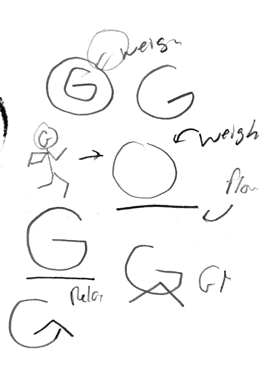
Process
I began sketching possible ideas. This was difficult as I had to think of ways I could incorporate the weight motif without looking "stuck in the past".
1. I needed to retain the loyal fan-base and iconic muscle man motif and origin.
2. The redesign had to attract a more diverse audience, illustrating Gold's Gym is for everyone, not just bodybuilders.
Brainstorm
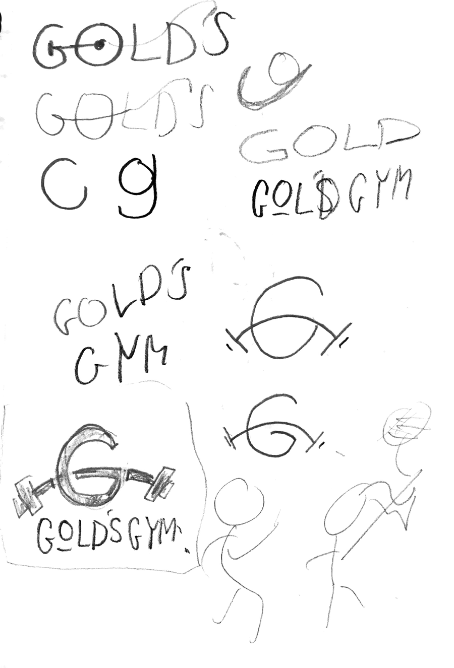
Redesign
Logo
The new G icon retains the iconic arched dumbbell from the mascot,
highlighting the golden G. This new logo is also better suited for small screen sizes and fitness
gear flexing to the digital age.
The original mascot will get an update and be accompanied by a diverse set of characters, male,
female and others as supporting brand elements, staying true to the company’s heritage.

Golden Ratio
The new G icon also comfortably fits in the suitable “Golden Ratio” for perfect proportions and scaling.

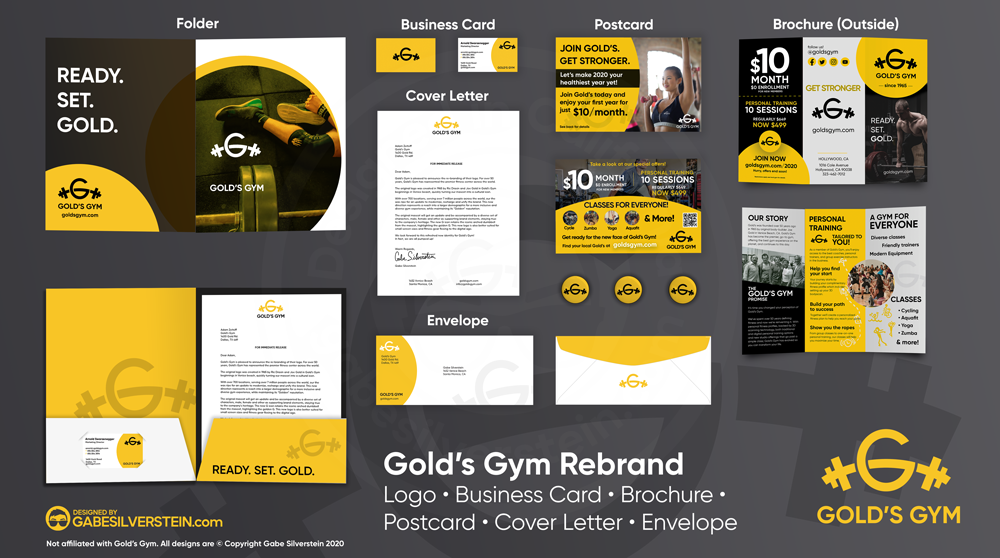
Cover Letter
Cover letter “For Immediate Release” showcasing the logo and muted G accented logo.
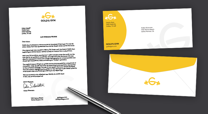
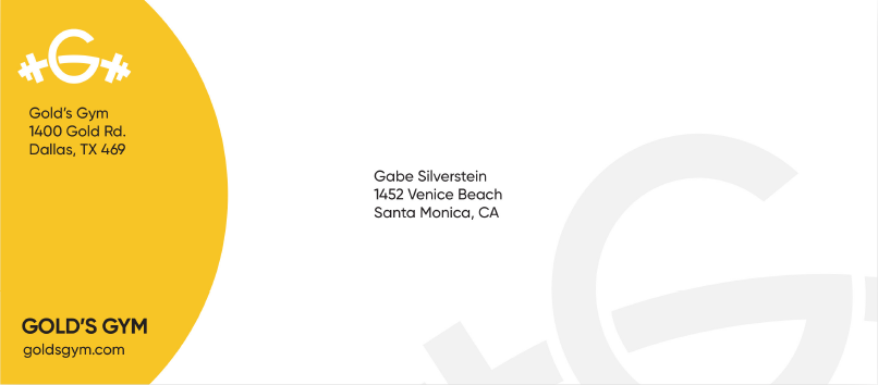
Envelope
Envelope design utilizing the semicircle G motif and muted logo as a background supporting element.
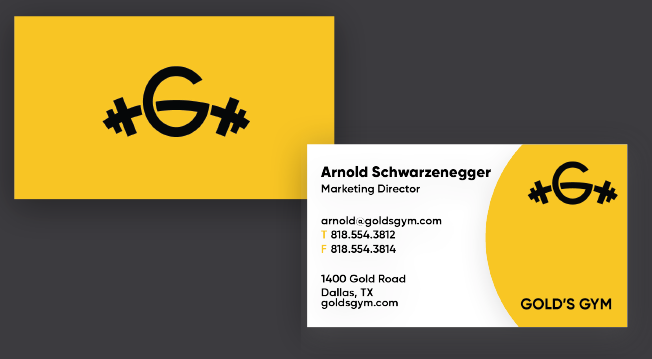
Business Card
Business Cards featuring the same, semi-circle design, while adapting to display different information.
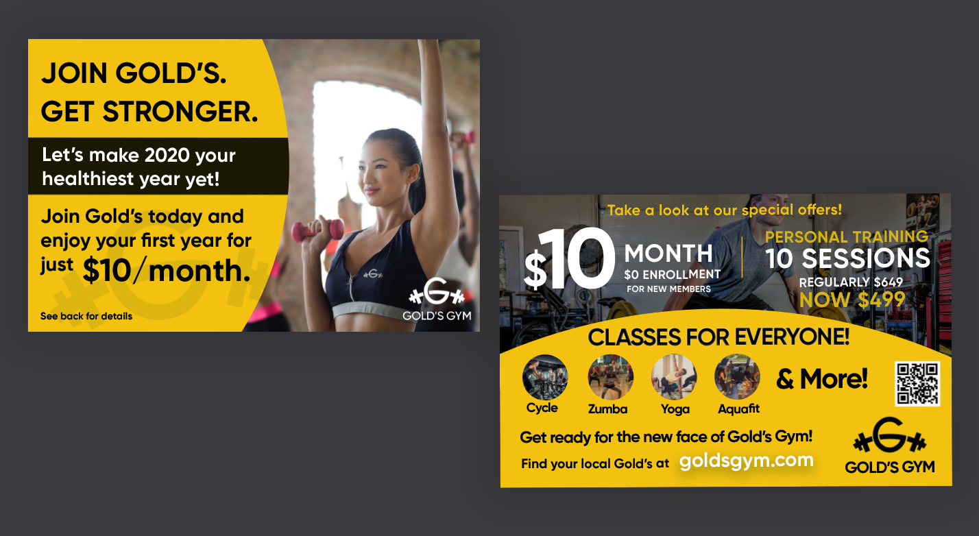
Postcard
Postcard designs highlighting possible new gym promotions.
Gold’s is
not just for bodybuilders, and these postcards illustrate this new direction: “Classes for
everyone”.
QR Code to take users to promotional page on official goldsgym.com website.
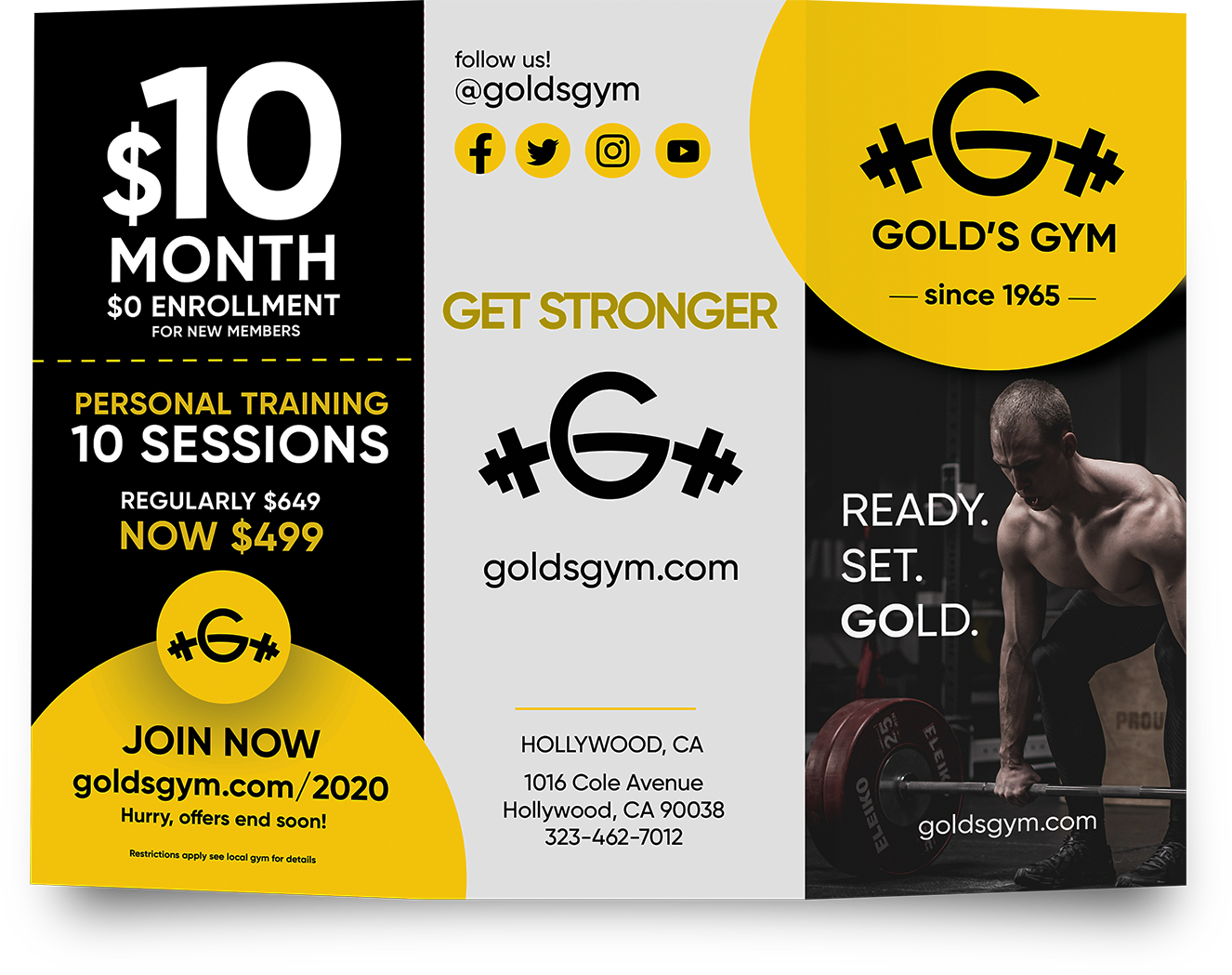
Brochure
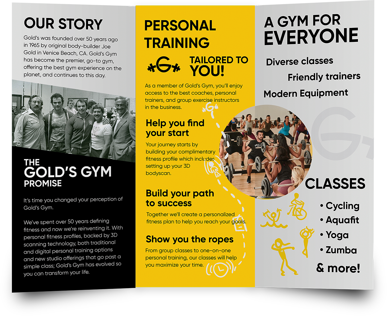
Brochure detailing Gold’s Gym storied history, personal training options, promotional deals, along with its diverse gym and class options.
Stationery Mockup
Reflection
This project proved to be an extraordinary learning experience!
Although at first, the task of redesigning such an iconic brand seemed daunting but the challenge proved
to
be rewarding.
Through persistence and perseverance, I finally was able to create a solution which pays tribute to the
brand’s legacy, while advancing the gym into the future.
![]() Disclaimer:
Gold's Gym and the Gold's Gym logo are all trademarks of Gold's Gym
Inc., registered in the U.S. and other countries.
Disclaimer:
Gold's Gym and the Gold's Gym logo are all trademarks of Gold's Gym
Inc., registered in the U.S. and other countries.
This project is not associated whatsoever with Gold's Gym.
All designs are copyright Gabe
Silverstein
2020
Projects you might like